Loading...
ApexPlast Pro: Injection Moulding Manufacturer Website
A clean corporate website for plastic injection moulders serving industrial and consumer brands, with a product catalog, manufacturing and QC pages, quote requests and a built-in admin CMS.
1 / 4
Features
Corporate Split Hero
A bold headline with a teal subline, a pink "Get a Custom Quote" button and a large facility video card on a subtle dot-grid background, followed by a five-point trust strip.
Product Catalog with Live Counts
The navigation shows the live product count, and the catalog offers category chips, instant search across name, code and material, and a clean card grid.
Manufacturing & QC Page
A dedicated capabilities page with a plant machinery table, tonnage ranges and the quality-control process from resin testing to dispatch.
Quote Requests & WhatsApp
Quick-enquiry modals on product cards, a contact page with a formal quotation form, and a pre-filled WhatsApp message on every product page.
Trust-Focused Footer
An upper trust banner (ISO 9001:2015, 14,500 MT capacity, 24/7 operations, dedicated sales desk) above category links, quick links and plant contact details.
Admin CMS & Lead Inbox
Dashboard, product table, add/edit product form with image upload, category manager and an enquiries inbox with New, Contacted and Resolved statuses.
What's included
- Complete React + TypeScript + Vite source code
- 6 public pages: Home, Products Catalog, Product Detail, Manufacturing & QC, About Company and Contact Us
- Admin console: Login, Dashboard, Products, Add/Edit Product, Categories and Leads & Enquiries
- Navy, teal and pink brand system with Poppins typography as Tailwind CSS 4 tokens
- 15 bundled SVG line icons for trust and feature sections
- Sample catalog with 6 products across 5 categories and a demo admin account
Project Overview
ApexPlast Pro is a corporate redesign of the ApexPlast manufacturing platform, aimed at moulders who sell to both industrial buyers and consumer brands. Where the first edition is dark and editorial, this one is bright and approachable: a deep navy for text, teal for highlights and a confident pink for every call to action, all set in Poppins.
The homepage opens with a split hero ("Leading Plastic Injection Moulding Manufacturer for Industrial & Consumer Brands"), a facility video card and a trust strip (Made in USA plastics, 18+ years, family-owned, turnkey manufacturing, tonnage up to 1200). Visitors then move through product categories, featured products, company history, machinery capabilities, the production workflow and a final quote banner. The same admin CMS powers the catalog, so the manufacturer can keep products and leads up to date on their own.
Technical Implementation
Architecture
The app is a single-page React application built with Vite. All data and navigation state live in one CatalogContext: products, categories, enquiries, company details, the active public or admin page and the selected product. Data is saved to localStorage, so edits made in the admin console show up on the public site immediately.
Frontend
The visual identity is defined once as Tailwind CSS 4 theme tokens, so every component can use classes like bg-navy-900, text-teal-brand or bg-pink-brand:
@theme {
  --font-sans: 'Poppins', ui-sans-serif, system-ui, sans-serif;
  --color-navy-950: #061c27;
  --color-navy-900: #0a2a3a;
  --color-teal-brand: #0b7a94;
  --color-teal-soft: #e3f1f5;
  --color-pink-brand: #f0246e;
  --color-pink-dark: #d11a5c;
  --color-mist: #eef3f6;
}

.dot-pattern {
  background-image: radial-gradient(#c5d3dc 1.2px, transparent 1.2px);
  background-size: 14px 14px;
}
The hero uses that dot pattern with a gradient mask, so the texture fades out towards the headline and never competes with the text:
<div className="absolute inset-0 dot-pattern opacity-60
  [mask-image:linear-gradient(to_top_right,#000,transparent_60%)] pointer-events-none" />
Key Technologies:
- Framework: React 19 + Vite
- Language: TypeScript
- Styling: Tailwind CSS 4 with a custom navy, teal and pink palette
- Icons: Lucide React plus bundled SVG line icons
- State Management: React Context with localStorage persistence
Admin CMS
The admin console has a dashboard with catalog and lead stats, a searchable product table, an add/edit product form (file upload, image URL or preset photos, automatic slugs, featured and published toggles), a category manager that warns before deleting a category that still has products, and a leads inbox with status tracking.
Challenges & Solutions
Challenge 1: One Engine, a Completely Different Brand
Problem: The client wanted a corporate look without rebuilding the catalog, enquiry and admin logic from the first edition.
Solution: All business logic stays in the shared context and data layer. The new identity comes from a new set of theme tokens and reworked presentation components (Hero, Navbar, Footer, ProductCard, CategoryCard, StatsSection), so the redesign is purely visual and the admin panel works exactly the same.
Challenge 2: Earning Trust Before the First Scroll
Problem: B2B buyers look for credibility signals before they even look at products.
Solution: The hero is followed straight away by a five-point trust strip, and the footer opens with a trust banner covering ISO certification, capacity, 24/7 operations and a dedicated sales desk. Certifications, capacity and experience are pulled from one CompanyInfo object, so they stay consistent on every page.
Challenge 3: Easy Navigation on Any Device
Problem: A long product-category navigation does not fit on small screens, and buyers often browse on their phones.
Solution: On desktop the navigation shows a live product-count badge and a pink "Get a Quote" button. On mobile it collapses into a drawer with the same links plus a shortcut to the admin console, and every grid reflows from four columns down to one.
Results & Impact
- Polished Corporate Presence: A bright, trustworthy design for injection moulders that serve industrial and consumer brands.
- Complete Catalog Experience: Category browsing, instant search, detailed specs and related products.
- More Qualified Quotes: Quick-enquiry modals, a formal quotation form and pre-filled WhatsApp messages capture the product and quantity up front.
- Self-Managed: The built-in admin CMS lets the team manage products, categories and leads without a developer.
More projects
View all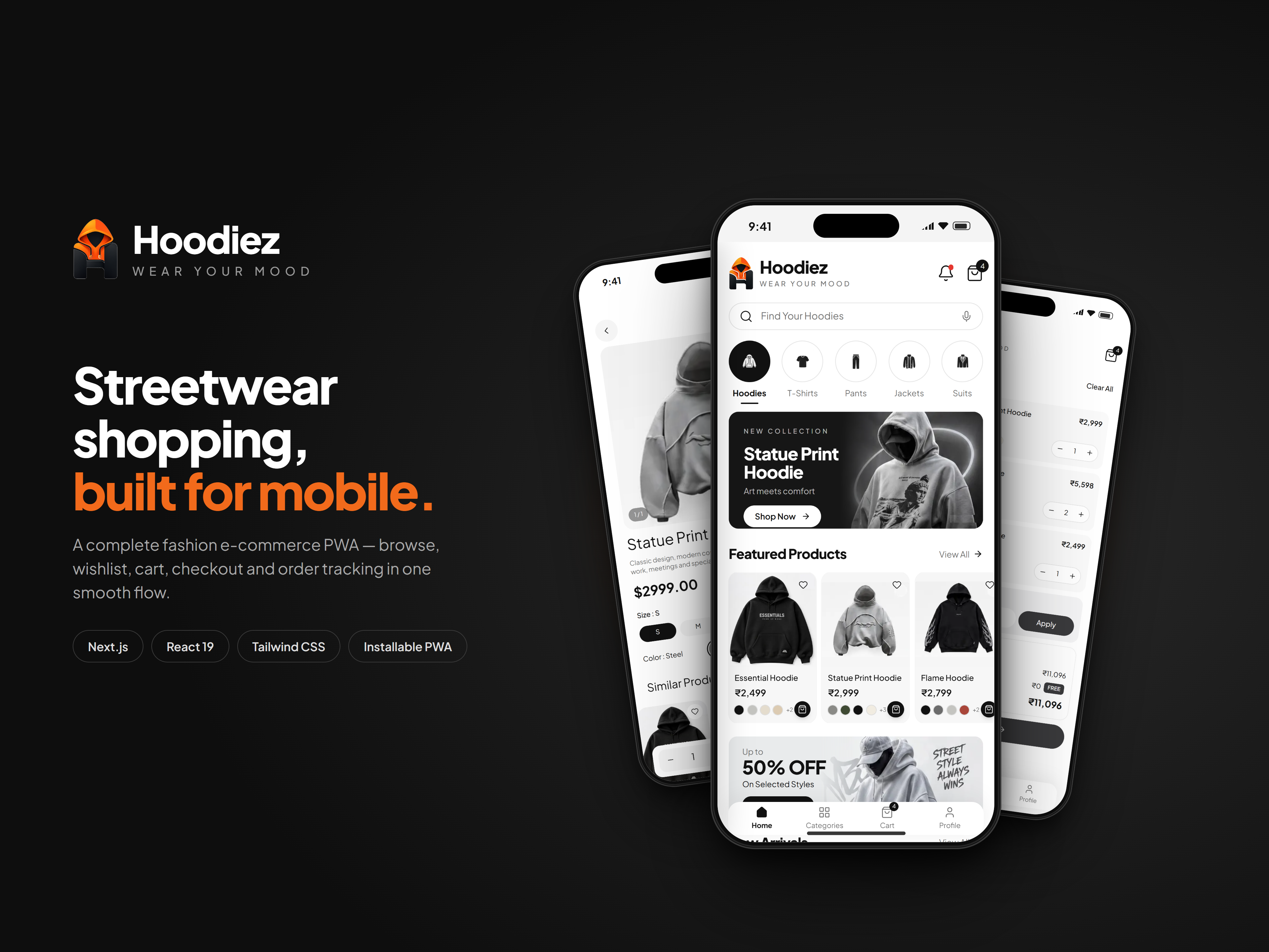
A mobile-first streetwear store with hoodie-led collections, rich product pages, a wishlist, a swipeable cart and a full UPI, card and cash-on-delivery checkout, all installable as an offline-ready PWA.
Hoodiez: Streetwear E-commerce Mobile App
Mobile Application · Next.js · React
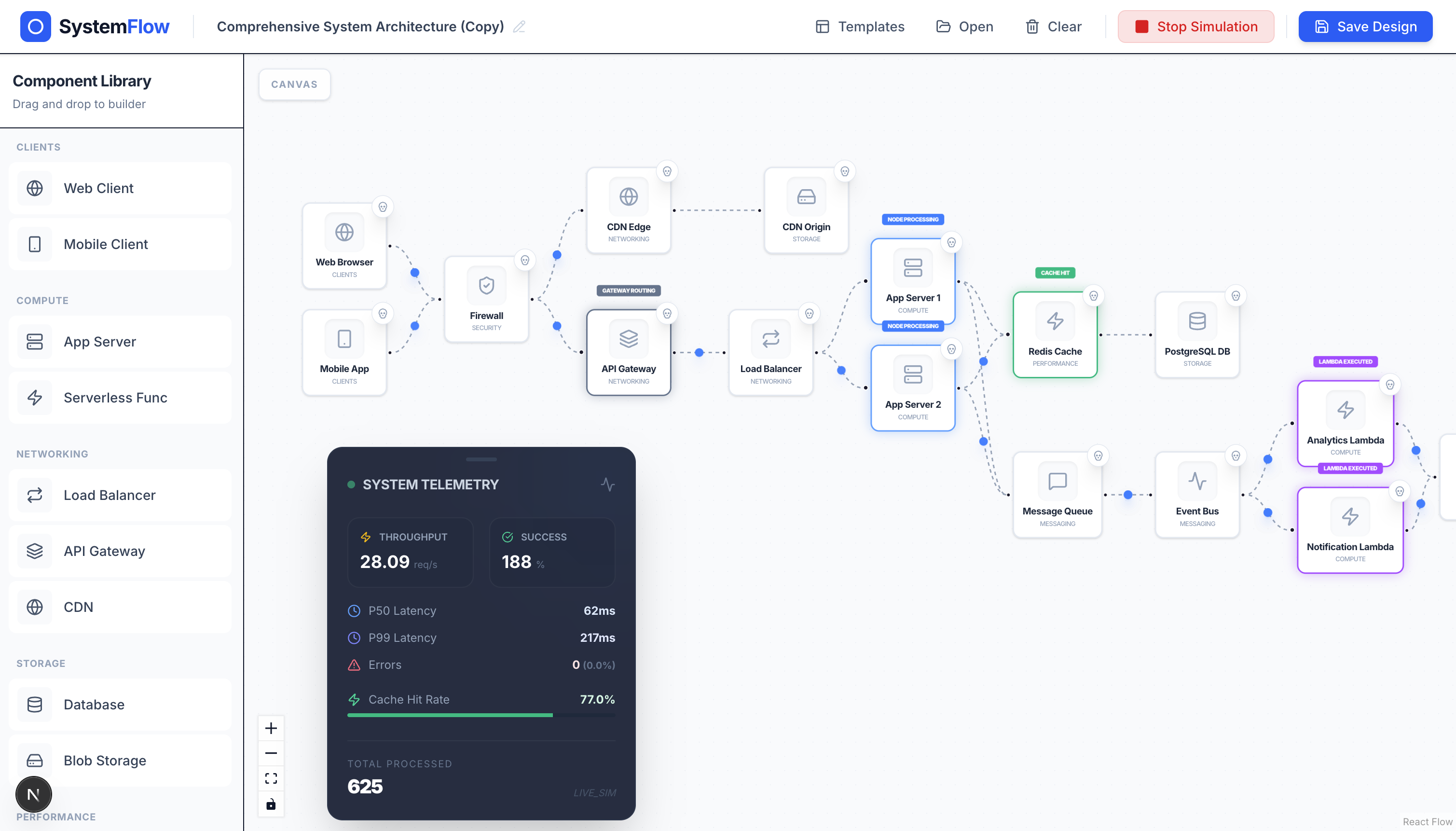
Design distributed system architectures on a drag-and-drop canvas and watch traffic, latency, and failures play out in real time.
PremiumSDApp: Visual System Design Simulator
Web Application · Next.js · React Flow
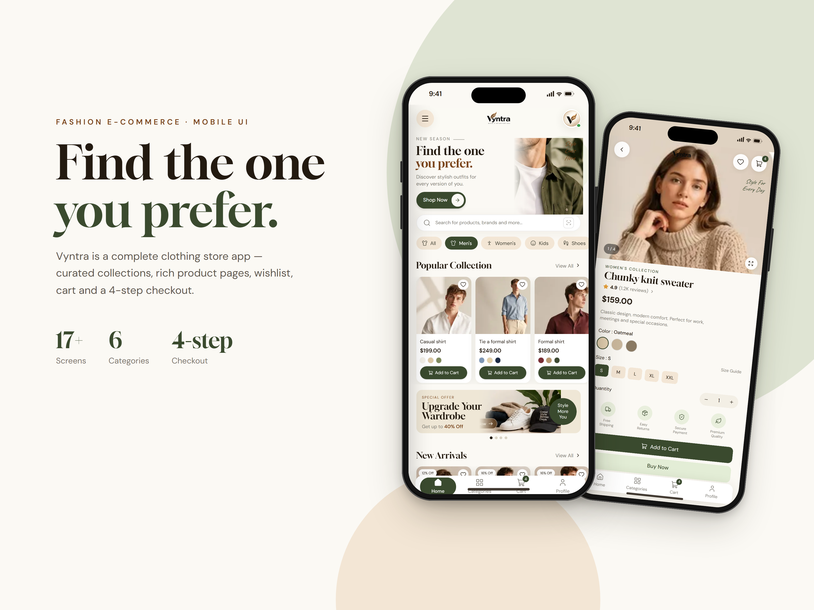
A mobile-first clothing store with curated collections, rich product pages, a wishlist, a cart and a smooth 4-step checkout, all installable as an offline-ready PWA.
Vyntra: Fashion E-commerce Mobile App
Mobile Application · Next.js · React